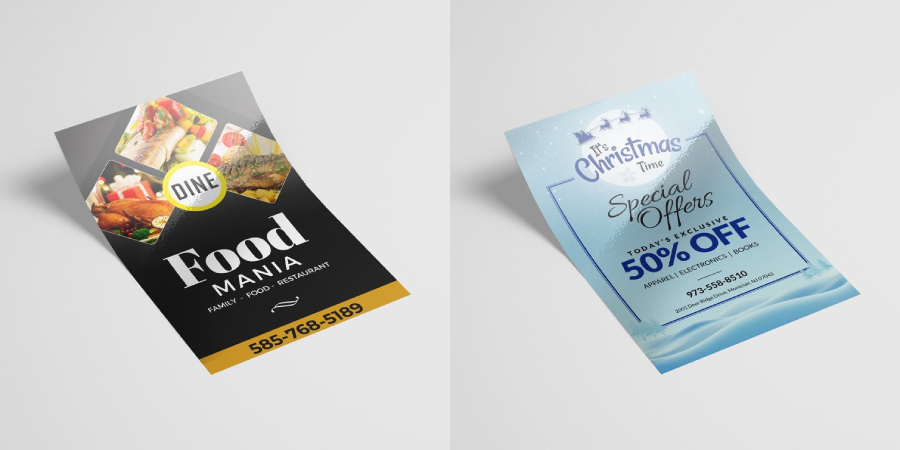
How to Design the Perfect Health Flyer: Format & Size Tips

Selecting and using the right format and size for your health flyers is paramount for ensuring they effectively communicate important information while being visually appealing. The right flyer design can help boost engagement, encourage attendance, and establish credibility for your health event or services.
These flyers can then help promote your events such as a wellness seminar, a health check-up event, or a fitness program. Follow these five steps to ensure your health flyers are both practical and eye-catching.
Step 1: Use Health Poster Templates
One of the simplest ways to design an effective health flyer is to use a template to give you a base structure. This is especially useful for individuals who don’t have enough experience in graphics designing. But experienced professionals can also find it helpful to use a template. They can reduce the time and effort involved in designing a poster.
To find these customizable health posters templates, go to PosterMyWall. This online platform offers a variety of pre-made designs that can be adjusted to fit different sizes and formats. Simply browse the available templates, choose one that aligns with your event or service, and customize it by adding details, colors, and branding elements.
This is a good example of the kind of templates you can find at the site. This has been designed for use by a medical center offering multiple services to the public and has stock images and text to reflect it as such. A medical center can use this template, swap out the text that contains details about the center, and go from there. Or, they can modify it further and swap out the images for their own, add more art or text, before downloading and printing. Something similar can also work for you.
Step 2: Select the Best Size
Flyers are used in various sizes, and choosing the right one depends on your distribution method and content. Standard sizes include:
- 4″ x 6″ (Postcard Size): This is best for handouts and direct mail campaigns.
- 5.5″ x 8.5″ (Half Sheet): A compact option that delivers the essentials.
- 8.5″ x 11″ (Letter Size): The standard size, offering plenty of room for visuals and details.
- 11″ x 17″ (Tabloid Size): Best suited for posters and bulletin board displays.
Consider your target audience and how they will receive the flyer. If you place it in a location with more space, a larger size might be better, while smaller flyers work well for direct distribution.
Step 3: Choose the Right Layout
The layout of your flyer should ensure readability and visual appeal. As such, there are a few choices you can make accordingly. If your message is short and direct, a single-sided flyer may suffice. However, a double-sided flyer allows for additional content without overcrowding the design and gives more in-depth information.
You can choose between portrait and landscape formats if you want a visual-heavy design. Portrait is more common for flyers, while landscape may work well for posters and banners. You can also use a structured layout with sections for headings, images, and key details. This ensures clarity and keeps the flyer from appearing cluttered when you want to deliver key details in an easily digestible way.
Step 4: Optimize Text and Visual Elements
Balancing text and visuals is essential for an effective flyer. You want to ensure the reader can get the information presented most easily and efficiently possible. Use large, easily readable fonts and ensure headlines and key information stand out. Print out a prototype and look at it from a distance of a few feet. The design is good if you can make out the main details clearly.
Use relevant visuals to improve attractiveness and boost engagement. Images of healthcare professionals, wellness icons, or event snapshots can help liven up the design of your flyer. However, a flyer cluttered with too much text and images will make it hard to see it. As such, keep some whitespace to improve readability and visual appeal. It will break the design up to make the flyer appealing and easier to read.
Step 5: Print and Distribute Strategically
Once your flyer is designed, print it on high-quality paper for a professional look. Choose between glossy or matte finishes, depending on the setting. A glossy finish is best for colorful and vibrant designs that will be handed out to people or put up in doors. However, a matte finish is better for easy-to-read flyers heavier on textual elements.
Distribute flyers strategically in high-traffic areas such as hospitals, clinics, fitness centers, community boards, and coffee shops. Additionally, share a digital version of your flyer on social media, websites, and email newsletters to reach a broader audience.
Conclusion
Selecting the right format and size for your health flyers ensures they are effective, engaging, and visually appealing. This article has given the process of designing a poster in an easy step-by-step way following which you can create an eye catching and engaging health flyer.
A well-designed flyer can make a lasting impression and increase participation in your health-related event or service. Start designing your health flyer today and ensure your message reaches the right audience!


